

آموزش کامل Text Field در کامپوز Compose بیش از 10 مثال

Text Fieldها یکی از مهمترین بخشهای رابط کاربری توی برنامههای اندرویدن که کاربر ازشون برای وارد کردن یا ویرایش متن استفاده میکنه. توی Jetpack Compose هم ابزارهای خیلی خوبی برای ساختن TextField داریم که میتونیم به راحتی سفارشیشون کنیم و تجربه کاربری جذابتری بسازیم.
این مقاله از Text Fieldهای ساده شروع میکنه و میره تا موارد پیشرفته مثل فیلتر کردن داینامیک و کنترل مکان کرسر.
انواع Text Field های در اندروید و کامپوز
Text Field ساده
این سادهترین نوع TextField هست. یه مثال خیلی پایهای که از label و placeholder و یه سری استایل اولیه استفاده میکنه:
@Composable
fun BasicTextFieldExample() {
    var text = remember { mutableStateOf("") }

    TextField(
        value = text.value,
        onValueChange = { text.value = it },
        label = { Text("Enter your name") },
        placeholder = { Text("John Doe") },
        singleLine = true,
        modifier = Modifier.fillMaxWidth()
    )
}
توضیحش:
-
پارامترهای TextField:
-
value: این مشخص میکنه که الان چه متنی توی فیلد هست. معمولاً وصلش میکنیم به یه
stateکه بتونیم مقدارشو کنترل کنیم. -
onValueChange: هر وقت کاربر یه چیزی تایپ کنه، این تابع صدا زده میشه و میتونی باهاش state رو آپدیت کنی.
-
label و placeholder: اینا راهنمای کاربرن. label معمولاً بالای فیلد نمایش داده میشه و placeholder هم داخل فیلد وقتی که هیچی نوشته نشده.
-
singleLine: اگه بخوای فقط یه خط ورودی قبول کنی، اینو true بذار. برای مثلاً فیلد اسم خیلی خوبه.
-
modifier: برای تنظیم ظاهر استفاده میشه. مثلاً با
paddingفاصله میدی، باfillMaxWidth()اندازهاشو مشخص میکنی و کلی چیزای دیگه.
-
مطالعه بیشتر : آموزش Modifier در کامپوز
OutlinedTextField
نسخهای از TextField که یه کادر خطدار دورش داره و ظاهر مدرنتری به خودش میگیره:
@Composable

fun OutlinedTextFieldExample() {

    val text = remember { mutableStateOf("") }


    OutlinedTextField(

        value = text.value,

        onValueChange = { text.value = it },

        label = { Text("Email Address") },

        placeholder = { Text("example@domain.com") },

        singleLine = true,

        modifier = Modifier.fillMaxWidth(),

        isError = text.value.isNotEmpty() && !text.value.contains('@'),

    )

}
توی اینجا:
- از OutlinedTextField استفاده شده که ظاهر متفاوتی نسبت به TextField معمولی داره.
- isError بررسی میکنه اگر متن شامل @ نباشه، فیلد خطا بده.
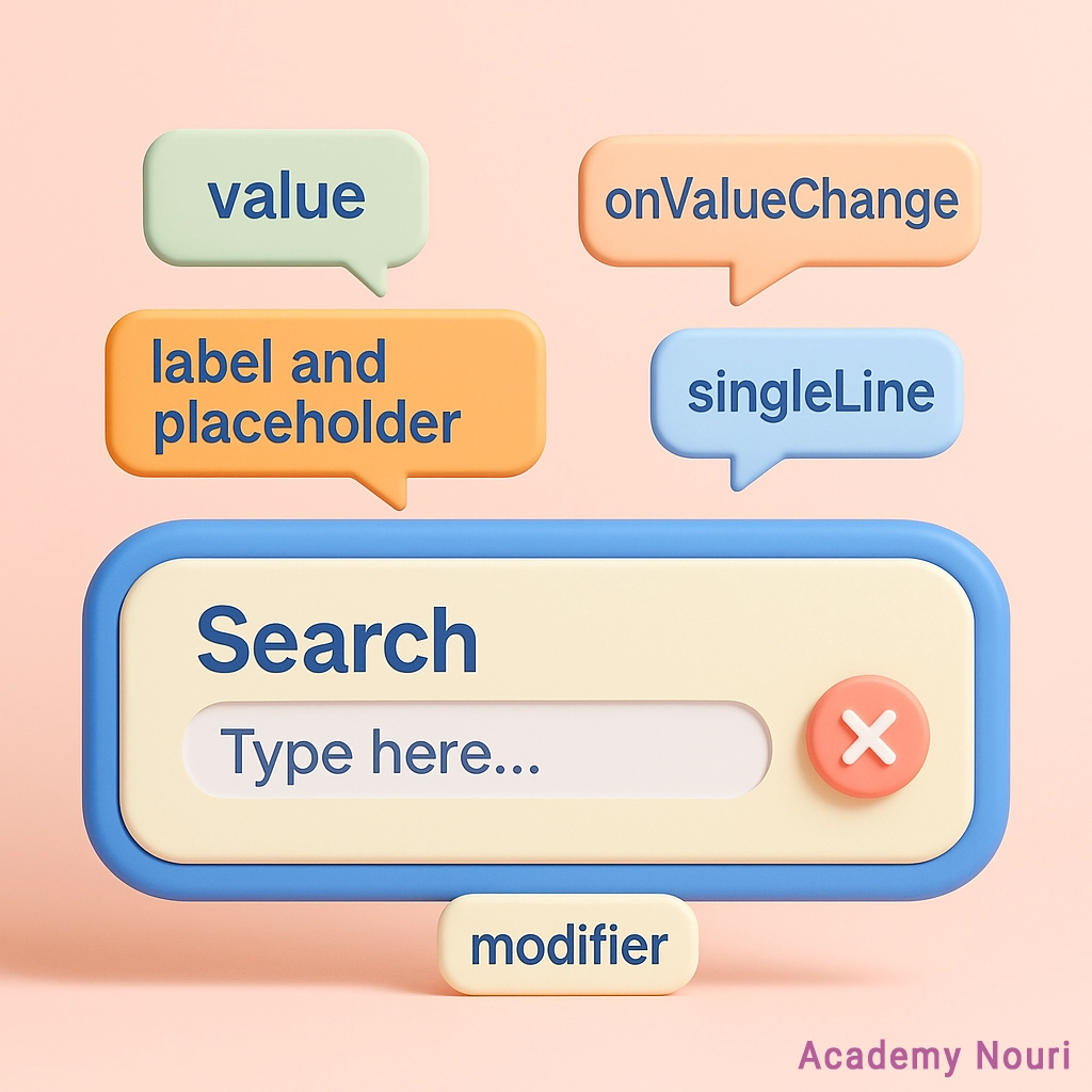
TextField با آیکون
توی این مثال یه آیکون در ابتدا (search) و یه دکمه پاککردن در انتها میذاریم:
@Composable

fun TextFieldWithIcons() {

    val text = remember { mutableStateOf("") }


    TextField(

        value = text.value,

        onValueChange = { text.value = it },

        label = { Text("Search") },

        placeholder = { Text("Type here...") },

        singleLine = true,

        leadingIcon = { Icon(Icons.Filled.Search, contentDescription = "Search Icon") },

        trailingIcon = {

            if (text.value.isNotEmpty()) {

                IconButton(onClick = { text.value = "" }) {

                    Icon(Icons.Filled.Clear, contentDescription = "Clear Text")

                }

            }

        },

        modifier = Modifier.fillMaxWidth()

    )

}
نکته خاصش اینه که آیکون سمت راست فقط وقتی نشون داده میشه که کاربر چیزی تایپ کرده باشه.
TextField برای پسورد
برای ورودی رمز عبور، میخوایم چیزی که تایپ میشه رو نشون ندیم:
@Composable

fun PasswordTextFieldExample() {

    var password = remember { mutableStateOf("") }


    TextField(

        value = password.value,

        onValueChange = { password.value = it },

        label = { Text("Password") },

        visualTransformation = PasswordVisualTransformation(),

        keyboardOptions = KeyboardOptions(keyboardType = KeyboardType.Password),

        singleLine = true,

        modifier = Modifier.fillMaxWidth(),

        isError = password.value.isNotEmpty() && password.value.length < 8,

        colors = TextFieldDefaults.colors()

    )

}
اینجا اگه رمز کمتر از ۸ کاراکتر باشه، فیلد قرمز میشه.
Text Field با اعتبارسنجی لحظهای
یعنی در لحظه بررسی کنیم که مقدار ورودی معتبر هست یا نه:
@Composable

fun TextFieldWithError() {

    var text = remember { mutableStateOf("") }

    val isValid = text.value.length >= 3


    TextField(

        value = text.value,

        onValueChange = { text.value = it },

        label = { Text("Username") },

        isError = !isValid,

        placeholder = {

            if (!isValid) Text("Username must be at least 3 characters")

        },

        modifier = Modifier.fillMaxWidth()

    )

}
این حالت برای فرمهایی که میخوای فیدبک سریع بدی خیلی خوبه.
سرچبار Text Field
یه نمونه مخصوص سرچ کردن با آیکون جستجو و پاککن:
@Composable

fun SearchBarTextField() {

    var query = remember { mutableStateOf("") }


    TextField(

        value = query.value,

        onValueChange = { query.value = it },

        placeholder = { Text("Search...") },

        singleLine = true,

        leadingIcon = { Icon(Icons.Filled.Search, contentDescription = "Search Icon") },

        trailingIcon = {

            if (query.value.isNotEmpty()) {

                IconButton(onClick = { query.value = "" }) {

                    Icon(Icons.Filled.Clear, contentDescription = "Clear Text")

                }

            }

        },

        modifier = Modifier.fillMaxWidth()

    )

}
TextField پسورد با نمایش یا پنهان کردن رمز
تو این حالت کاربر میتونه انتخاب کنه رمز دیده بشه یا نه:
@Composable

fun PasswordTextFieldWithToggle() {

    val (password, setPassword) = remember { mutableStateOf("") }

    val (passwordVisible, setPasswordVisible) = remember { mutableStateOf(false) }


    TextField(

        value = password,

        onValueChange = setPassword,

        label = { Text("Password") },

        visualTransformation = if (passwordVisible) VisualTransformation.None else PasswordVisualTransformation(),

        keyboardOptions = KeyboardOptions(keyboardType = KeyboardType.Password),

        trailingIcon = {

            val image = if (passwordVisible) Icons.Filled.Lock else Icons.Filled.CheckCircle

            val description = if (passwordVisible) "Hide password" else "Show password"

            IconButton(onClick = { setPasswordVisible(!passwordVisible) }) {

                Icon(image, contentDescription = description)

            }

        },

        modifier = Modifier.fillMaxWidth()

    )

}
اینجا از یه قابلیت Kotlin به اسم destructuring استفاده شده که مقدار state و setterش رو تو یه خط از هم جدا میکنیم.
TextField با استایل پیشرفته
استایلهای مختلف، کنترل کیبورد، رنگها و …:
@Composable

fun EnhancedTextFieldExample() {

    val text = remember { mutableStateOf("") }

    val keyboardController = LocalSoftwareKeyboardController.current


    TextField(

        value = text.value,

        onValueChange = { text.value = it },

        label = { Text("Label") },

        placeholder = { Text("Enter text") },

        leadingIcon = { Icon(Icons.Filled.Info, contentDescription = "Info") },

        trailingIcon = {

            IconButton(onClick = { text.value = "" }) {

                Icon(Icons.Filled.Clear, contentDescription = "Clear")

            }

        },

        keyboardOptions = KeyboardOptions.Default.copy(

            keyboardType = KeyboardType.Text,

            imeAction = ImeAction.Done

        ),

        keyboardActions = KeyboardActions(

            onDone = {

                keyboardController?.hide()

            }

        ),

        singleLine = true,

        textStyle = TextStyle(color = Color.Black, fontWeight = FontWeight.Bold),

        colors = TextFieldDefaults.colors(

            focusedTextColor = Color.Blue,

            errorTextColor = Color.Red,

            focusedContainerColor = Color.LightGray,

            errorContainerColor = Color.Red,

            cursorColor = Color.Blue

        ),

        modifier = Modifier.fillMaxWidth()

    )

}
توی این مدل هر چی بخوای از نظر ظاهر میتونی تنظیم کنی.
فیلد ورودی عدد (فقط عدد وارد کن)
اینجا میخوایم فقط عدد دریافت کنیم، مثل شماره موبایل، کد پین یا هر چیز عددی دیگه:
@Composable

fun NumberInputField() {

var number by remember { mutableStateOf("") }


TextField(

value = number,

onValueChange = { input ->

if (input.all { it.isDigit() }) {

number = input

}

},

label = { Text("Enter Number") },

keyboardOptions = KeyboardOptions(

keyboardType = KeyboardType.Number

),

modifier = Modifier.fillMaxWidth()

)

}
فقط وقتی ورودی عدد باشه قبولش میکنیم. همین باعث میشه کاربر نتونه حرف یا کاراکتر خاص بزنه.
ورودی شماره تلفن با ارور
اینجا یه فیدبک فوری هم میدیم اگه شماره تلفن اشتباه بود:
@Composable

fun PhoneNumberInputField() {

    var phoneNumber by remember { mutableStateOf("") }

    var errorMessage by remember { mutableStateOf<String?>(null) }


    Column(modifier = Modifier) {

        TextField(

            value = phoneNumber,

            onValueChange = { input ->

                if (input.all { it.isDigit() } && input.length <= 10) {

                    phoneNumber = input

                    errorMessage = null

                } else {

                    errorMessage = "Please enter a valid phone number."

                }

            },

            label = { Text("Enter Phone Number") },

            keyboardOptions = KeyboardOptions(keyboardType = KeyboardType.Phone),

            isError = errorMessage != null,

            modifier = Modifier.fillMaxWidth()

        )

        if (errorMessage != null) {

            Text(

                text = errorMessage ?: "",

                color = Color.Red,

                style = MaterialTheme.typography.bodySmall,

                modifier = Modifier.padding(top = 4.dp)

            )

        }

    }

}
اگه عددی نباشه یا طولش زیاد باشه، پیام خطا میفرسته.
فیلد ایمیل با اعتبارسنجی
با استفاده از regex بررسی میکنیم ایمیل درسته یا نه:
@Composable

fun EmailInputField() {

    var email by remember { mutableStateOf("") }

    var errorMessage by remember { mutableStateOf<String?>(null) }


    val emailPattern = "[a-zA-Z0-9._%+-]+@[a-zA-Z0-9.-]+\\.[a-zA-Z]{2,}"


    Column(modifier = Modifier) {

        TextField(

            value = email,

            onValueChange = { input ->

                email = input

                errorMessage = if (input.matches(emailPattern.toRegex())) {

                    null

                } else {

                    "Please enter a valid email address."

                }

            },

            label = { Text("Enter Email") },

            keyboardOptions = KeyboardOptions(keyboardType = KeyboardType.Email),

            isError = errorMessage != null,

            modifier = Modifier.fillMaxWidth()

        )

        if (errorMessage != null) {

            Text(

                text = errorMessage ?: "",

                color = Color.Red,

                style = MaterialTheme.typography.bodySmall,

                modifier = Modifier.padding(top = 4.dp)

            )

        }

    }

}
توی این حالت وقتی یه ایمیل اشتباه تایپ میکنی، سریع میفهمی.
TextField چند خطی با محدودیت کاراکتر
ایدهآل برای بخش کامنت یا فیدبک کاربران:
@Composable

fun MultiLineTextField() {

    var text by remember { mutableStateOf("") }

    val charLimit = 150


    TextField(

        value = text,

        onValueChange = {

            if (it.length <= charLimit) {

                text = it

            }

        },

        label = { Text("Enter your comment") },

        placeholder = { Text("Write something...") },

        modifier = Modifier.fillMaxWidth(),

        maxLines = 5,

        textStyle = TextStyle(color = Color.Black),

        colors = TextFieldDefaults.colors(),

        singleLine = false

    )

}
چند خطی تایپ میشه، ولی بیشتر از ۱۵۰ کاراکتر نمیذاره.
فیلد با ماسک شماره و کنترل مکان کرسر
شماره تلفن رو به شکل فرمت شده نشون میده و کرسر همیشه ته متن باقی میمونه:
@Composable

fun MaskedInputField() {

    var textFieldValue by remember { mutableStateOf(TextFieldValue("")) }


    TextField(

        value = textFieldValue,

        onValueChange = { newValue ->

            val digits = newValue.text.replace(Regex("[^\\d]"), "")

            val formattedText = when {

                digits.length >= 10 -> "(${digits.substring(0, 3)}) ${digits.substring(3, 6)}-${digits.substring(6, 10)}"

                digits.length >= 6 -> "(${digits.substring(0, 3)}) ${digits.substring(3, 6)}-${digits.substring(6)}"

                digits.length >= 3 -> "(${digits.substring(0, 3)}) ${digits.substring(3)}"

                else -> digits

            }


            textFieldValue = TextFieldValue(

                text = formattedText,

                selection = TextRange(formattedText.length)

            )

        },

        label = { Text("Enter Phone Number") },

        placeholder = { Text("(123) 456-7890") },

        keyboardOptions = KeyboardOptions(keyboardType = KeyboardType.Number),

        modifier = Modifier.fillMaxWidth()

    )

}
این یکی خیلی شیکه. شماره رو اتوماتیک فرمت میکنه.
TextField با حروف بزرگ خودکار
اگه اسم یا عنوان تایپ میکنی، این گزینه به درد میخوره:
@Composable

fun CapitalizedTextField() {

    var text by remember { mutableStateOf("") }


    TextField(

        value = text,

        onValueChange = { input ->

            text = input.replace(Regex("^(\\w)|\\s+(\\w)")) {

                it.value.uppercase()

            }

        },

        label = { Text("Full Name") },

        placeholder = { Text("John Doe") },

        keyboardOptions = KeyboardOptions(

            keyboardType = KeyboardType.Text,

            capitalization = KeyboardCapitalization.Words

        ),

        modifier = Modifier.fillMaxWidth()

    )

}
حرف اول هر کلمه رو خودش بزرگ میکنه.
TextField با پیشوند و پسوند
برای مقادیری مثل پول خیلی کاربرد داره:
@Composable

fun PrefixSuffixTextField() {

    var amount by remember { mutableStateOf("") }


    TextField(

        value = amount,

        onValueChange = { input ->

            if (input.all { it.isDigit() || it == '.' }) {

                amount = input

            }

        },

        label = { Text("Amount") },

        placeholder = { Text("0.00") },

        leadingIcon = { Text("$") },

        trailingIcon = { Text("USD") },

        keyboardOptions = KeyboardOptions(keyboardType = KeyboardType.Number),

        modifier = Modifier.fillMaxWidth()

    )

}
مقدار ورودی فقط عدد و نقطه میپذیره. کنارشم علامت دلار و واحد پول نشون داده میشه.
BasicTextField کپسولی شکل
یه طراحی جذاب که ظاهر Text Field رو شبیه قرص میکنه، همراه با رنگهای دینامیک:
@Composable

fun EnhancedCapsuleTextField() {

    var textState by remember { mutableStateOf(TextFieldValue("")) }

    var isFocused by remember { mutableStateOf(false) }

    var isError by remember { mutableStateOf(false) }

    var isSuccess by remember { mutableStateOf(false) }


    val borderColor by animateColorAsState(

        targetValue = when {

            isError -> Color.Red

            isSuccess -> Color(0xFF4CAF50)

            isFocused -> Color.Black

            else -> Color.Gray

        }

    )


    val textColor by animateColorAsState(

        targetValue = if (isError) Color.Red else Color.Black

    )


    Box(

        modifier = Modifier.fillMaxWidth(),

        contentAlignment = Alignment.TopStart

    ) {

        Card(

            shape = RoundedCornerShape(30.dp),

            elevation = CardDefaults.cardElevation(12.dp),

            colors = CardDefaults.cardColors(containerColor = Color(0xFFF5F5F5)),

            modifier = Modifier.fillMaxWidth()

        ) {

            BasicTextField(

                value = textState,

                onValueChange = {

                    textState = it

                    isError = textState.text.length < 3

                    isSuccess = textState.text.length >= 3

                },

                modifier = Modifier

                    .fillMaxWidth()

                    .height(56.dp)

                    .background(

                        brush = Brush.horizontalGradient(

                            listOf(Color(0xFFBBDEFB), Color(0xFFE3F2FD))

                        ),

                        shape = CircleShape

                    )

                    .border(

                        width = 2.dp,

                        color = borderColor,

                        shape = CircleShape

                    )

                    .onFocusChanged { focusState -> isFocused = focusState.isFocused }

                    .padding(horizontal = 16.dp, vertical = 8.dp),

                cursorBrush = SolidColor(if (isError) Color.Red else Color.Blue),

                textStyle = TextStyle(

                    color = textColor,

                    fontSize = 16.sp,

                    textAlign = TextAlign.Start,

                    shadow = Shadow(color = Color.Gray, blurRadius = 1f)

                ),

                decorationBox = { innerTextField ->

                    Box(

                        contentAlignment = Alignment.CenterStart,

                        modifier = Modifier.fillMaxSize()

                    ) {

                        if (textState.text.isEmpty()) {

                            Text(

                                text = "Enter your text here...",

                                color = Color.Gray,

                                fontSize = 16.sp

                            )

                        }

                        innerTextField()

                    }

                }

            )

        }

    }

}
ظاهر خاص و شیکی داره. مرز دور Text Field بسته به وضعیتش رنگش تغییر میکنه.
نتیجهگیری
با Jetpack Compose واقعاً میتونی هر مدل TextField که دلت بخواد بسازی. چه ساده، چه پیچیده. با قابلیتهایی مثل فیلد رمز، ایمیل، تعداد کاراکتر محدود، فیلد با آیکون، استایلهای رنگی و حتی ماسک کردن شماره. خلاصهاش اینکه تقریباً هر نیازی که از یه فیلد ورودی انتظار داری، قابل پیادهسازیه.
همچنین میتونید کل این کد ها رو از اینجا دریافت کنید
موفق باشید .